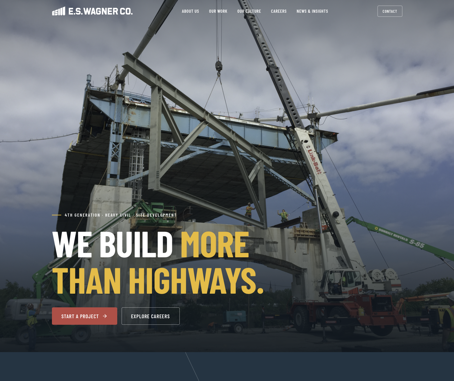
Identical content, same twelve sections, same copy drawn from the Statement of Qualifications and the 2026 brand voice — explored through two distinct layouts, all built on the E.S. Wagner design system.
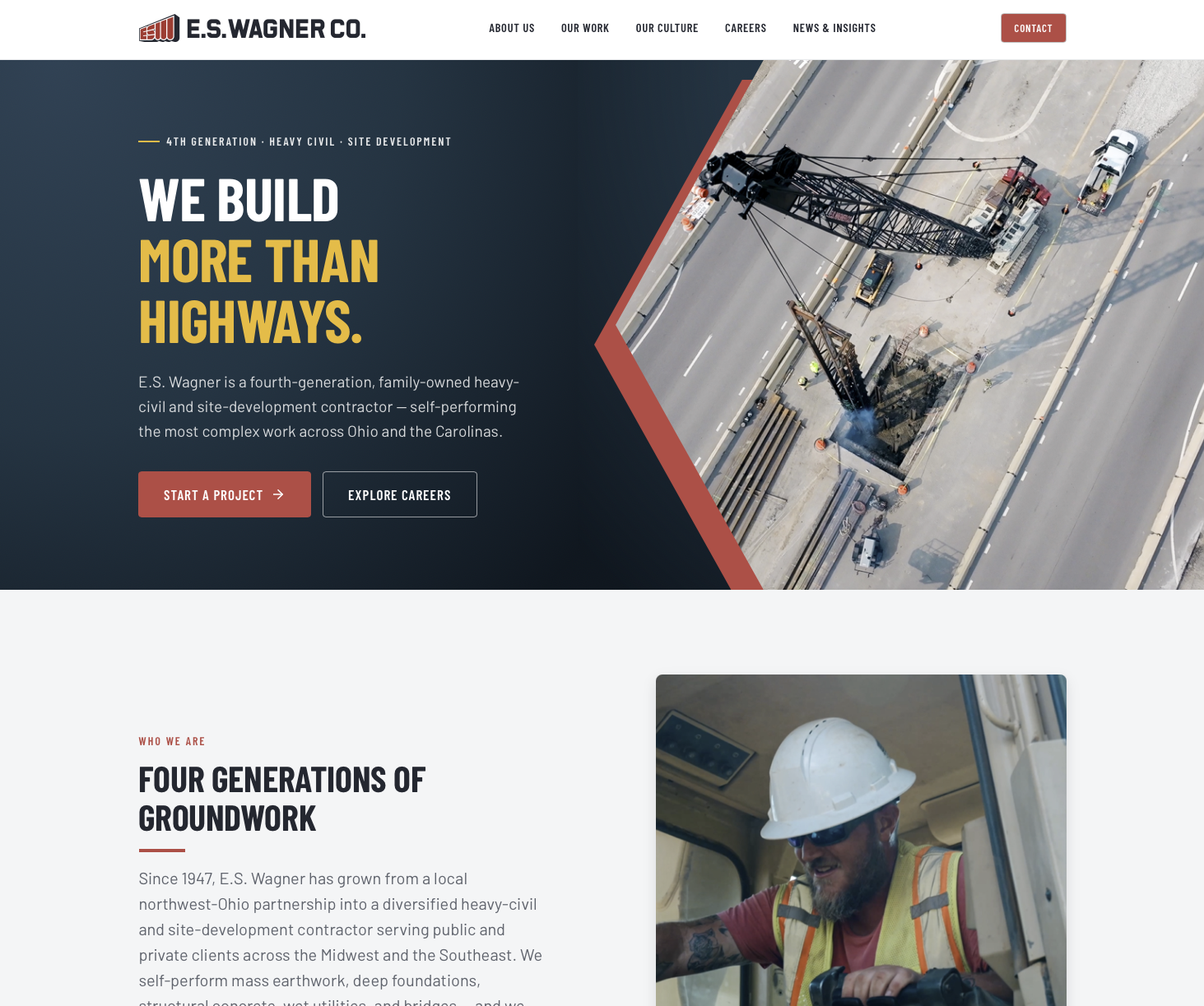
Opts for a lighter, airier layout with generous white space, contained hero imagery, and angled/diagonal photo cropping for a more polished, magazine-style read. Red accents and cleaner card grids make it feel more corporate and refined while still nodding to the construction sector.
View this directionLeads with a full-bleed, edge-to-edge hero photo and carries dark navy backgrounds throughout, giving it a rugged, cinematic, "in the field" feel. Bold condensed uppercase type and yellow-gold accents reinforce a heavy-industrial, boots-on-the-ground identity.
View this directionSame content, two treatments. Each page is fully responsive (resize or open on a phone for the mobile view) and follows the homepage outline section-for-section: Hero · Positioning · Stat Band · Sectors · Featured Projects · Careers · Culture · Safety · News · Capability · Closing CTA · Locations. Confidential projects shown anonymized per the outline; final figures, project clearances, and labels to be confirmed with ESW.